CSS, Tailwind
반복되는 컴포넌트에 tailwind nth-child 적용하기
Mori_FEDev
2023. 3. 7. 12:21
tailwind nth-child 적용하기.
fitst-child 축약어:
first:속성
nth-last-child는
xl사이즈일경우 이렇게 쓴다.
xl:last:w-[588px]
nth-child(4)번째를 선택한다면
[&:nth-child(4)]:md:w-[337px]
반복되는 컴포넌트이지만 태블릿(768px)일때부터 달라질 경우
nth-child 지정을 해서 상황에 맞게 조절할 수 있었다.
모바일일땐 세로, 768부터 nth-child(4), nth-child(5) (last-chlid)일 경
react + tailwind 조합이라 className안에 속성을 썼다.
<div className="flex justify-center">
  <div className="mx-auto flex flex-col flex-wrap items-center md:w-[688px] md:flex-row md:justify-between xl:w-[1200px]">
    {cardContent?.map((item, index) => {
      return (
        <div
          key={index}
          className="mb-[20px] flex w-[255px]
    flex-col overflow-hidden rounded-3xl
     bg-[#3365AF] text-center text-white md:w-[220px] md:flex-row md:justify-between md:last:w-[337px] xl:w-[384px] xl:last:w-[588px]
     [&:nth-child(4)]:md:w-[337px] [&:nth-child(4)]:xl:w-[588px]"
        >
          <div className="flex flex-col">
            <div className="m-auto h-[172px] w-full overflow-hidden xl:h-[300px]">
              <img className="h-full w-full object-cover" src={item.image} alt="ANATDEL IMAGE" />
            </div>
            <div className="flex h-[103px] flex-col items-center justify-center xl:h-[180px]  ">
              <div className="font18_EN xl:subTitleSize28_EN flex flex-col items-center">{item.text}</div>
            </div>
          </div>
        </div>
      );
    })}
  </div>
</div>
const cardContent = [
{
id: 1,
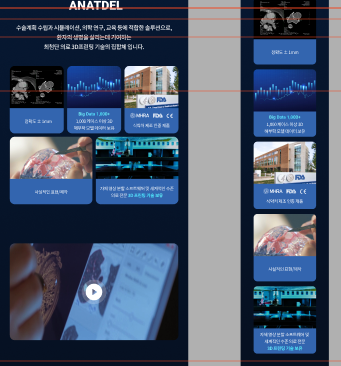
text: <span className="Linear block">Margin of error ± 1mm</span>,
image: '/images/anatdel/01.jpg',
},
{
id: 2,
text: (
<>
<span className="Linear block">Big Data 1,000+</span>
over 1000 cases of
<br />
3D anatomical model
</>
),
image: '/images/anatdel/02.jpg',
},
{
id: 3,
text: (
<>
<div className="verification_logo"></div>
<span className="Linear block">Product approved by KFDA</span>
</>
),
image: '/images/anatdel/03.jpg',
},
{
id: 4,
text: <span className="Linear block">Realistic finish</span>,
image: '/images/anatdel/04.jpg',
},
{
id: 5,
text: (
<div className="flex flex-col items-center md:flex-row">
<span className="font14_EN md:font18_EN xl:subTitleSize28_EN my-auto lg:my-0">
Our own image segmentation software <div className="block md:hidden " />
and world-class medical
<br className="hidden md:block xl:hidden" />
<span className="Linear block md:inline">3D printing technology</span>
</span>
</div>
),
image: '/images/anatdel/05.jpg',
},
];